Task Flow
How to open and read the Task Flow dialog in JiraMetrics.Pro — a breakdown of a task's journey across board columns, finding the causes of long lead times, and preparing material for retrospectives.
Overview
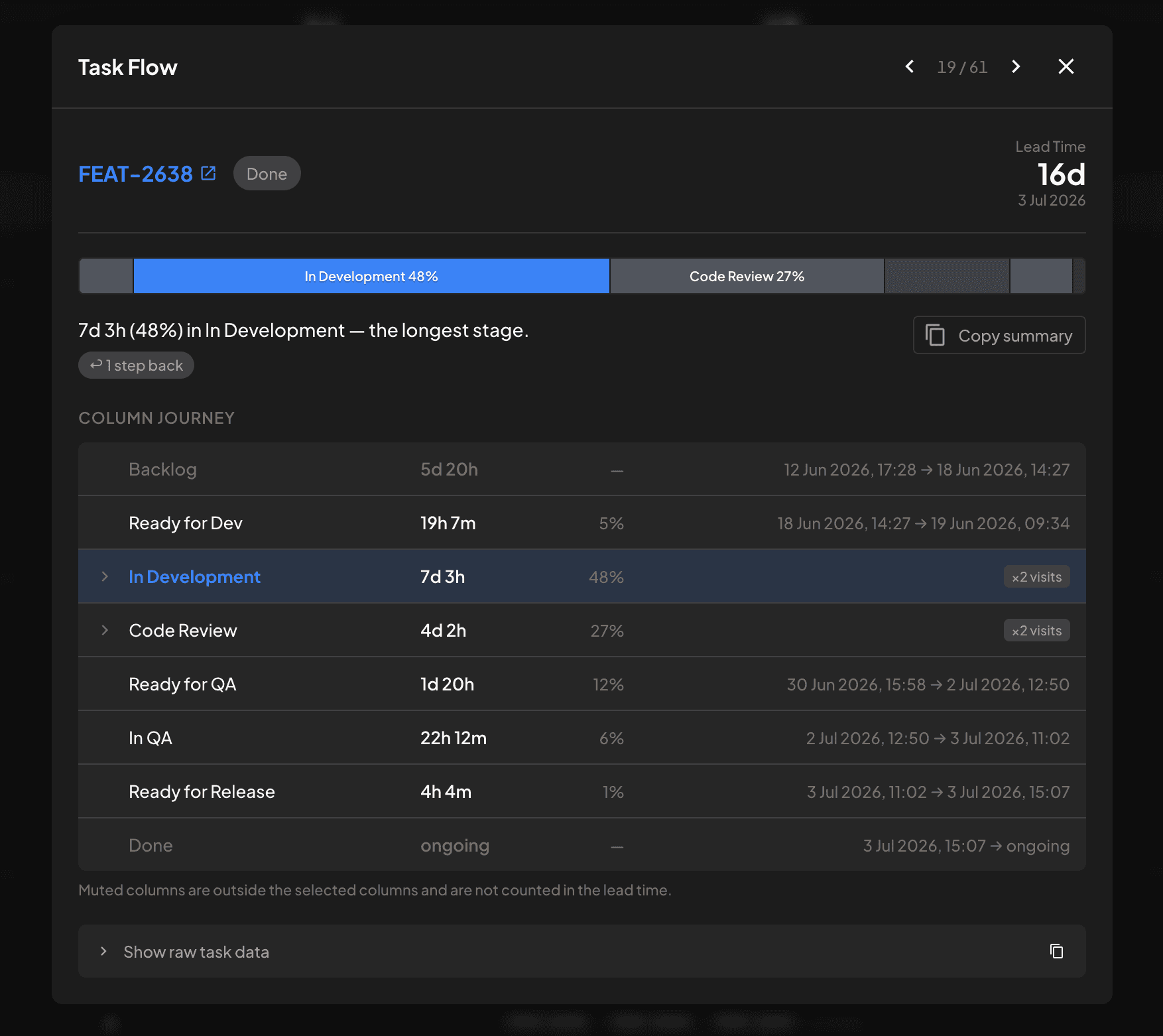
Task Flow is a dialog that breaks down a single task's completion time across the board columns. It answers three questions:
- Where did the time go? Which stage of the process took the most time for this particular task.
- Can the number be trusted? If part of the task's history had to be reconstructed, the dialog honestly warns that the Lead Time is approximate.
- How do I tell the team about it? One button copies a ready-made summary with a link to the task — convenient to paste into a retrospective document or a chat.
The dialog is especially useful for investigating "outliers" — tasks that took abnormally long. Instead of manually scrolling through the task history in Jira, in a few seconds you see which stage it got stuck in and whether it moved backward on the board.
How to Open the Dialog
Task Flow opens by clicking a task in almost any report:
- Control Chart — click a dot on the chart or a task key in the table below the chart (also works in the Control Chart dashboard widget).
- Aging Chart — click a task dot on the aging diagram.
- Tasks Table — click a task ID in the table.
- Lead Time — click a task in the report's table view, and also in the excluded tasks list.
- Throughput Chart — click a task key "pill" in the period's task list.
All the data for the dialog is already loaded with the report — no extra Jira requests are made, the dialog opens instantly.
What the Dialog Consists Of
Task Header
- Task key is a link: clicking it opens the task in Jira in a new tab.
- Current column — a badge with the column the task is in right now.
- Lead Time — the big number on the right: the task's total completion time. It is calculated and rounded the same way as in reports, so "150d" here matches "150 days" in the Control Chart table. Below it is the completion date, if the task is done.
Time Distribution Strip (FlowBar)
The full-width horizontal strip is the main visualization. Each segment is a board column (left to right in board order), and the segment width is the share of time the task spent in that column.
- One column is highlighted in blue — the one that took the most time. The rest are colored neutrally so your eye lands on what matters immediately.
- Segments shorter than 3% collapse into a single "Other (N)" segment to keep the strip readable.
- Hatched areas mark parts reconstructed from incomplete data (see "Trusting the Data").
- Hovering over a segment shows a tooltip: column name, duration, and percentage share.
Diagnosis Line
Below the strip is a single sentence that states the main takeaway, for example:
12d (46%) in "Code Review" — the longest stage.
Qualifier chips may appear next to it:
- "longest single stay N" — if the time in the longest column accumulated over several visits, the chip shows the longest uninterrupted stay.
- "↩ N steps back" — how many times the task moved backward on the board (to a column further left). A backward move is an observed movement; it does not necessarily mean rework, but frequent backward moves are a reason to look closer at the process.
- "⚠ approximate" — a noticeable part of the timeline was reconstructed; treat exact figures with caution.
The Copy summary button next to the diagnosis line copies a ready-made summary to the clipboard: the task link, Lead Time, the longest stage, and the number of backward moves. The format is designed so the line can be pasted straight into a retro document.
Column Journey
A table of all the columns the task passed through, in board order:
- Column name — the longest one is highlighted in bold and color.
- Time in column — total across all visits (or "ongoing" if the task is currently in that column).
- Share — percentage of the tracked time.
- "×N visits" — if the task entered the column more than once. Such a row expands on click: inside, each visit is shown separately with entry and exit dates, duration, and the number of status changes (hovering over the status-changes badge reveals the chain of statuses).
- For columns with a single visit, the transition dates are shown right in the row: "entry date → exit date".
Muted rows are columns not included in the "Columns" filter selection: time in them is not counted toward the Lead Time. A footnote below the table reminds you of this as well.
Navigating Between Tasks
If the dialog was opened from a task list (for example, from Tasks Table), arrows ←/→ and a "current / total" counter appear in the header. You can switch between tasks with the keyboard arrows — handy for quickly flipping through all long tasks in a row without closing the dialog.
Raw Data
At the bottom of the dialog is a collapsible Show raw task data block: the full task object in JSON format with a copy button. Useful when you need to check against the source data or attach it to a bug report.
Trusting the Data
The transition history in Jira is not always complete: some tasks have gaps, and JMP reconstructs the missing parts of the timeline. The dialog does not hide this:
- reconstructed visits are marked with a "reconstructed" badge (and hatching on the FlowBar strip);
- if the reconstructed part is significant (more than 15% of the time, or the longest column itself is affected), a warning appears: "⚠ Part of this timeline was reconstructed. Lead time is approximate" — along with an "approximate" chip in the diagnosis line.
This is intentional: it is better to know a number is approximate than to make decisions based on a precise-looking but unreliable figure.
How Percentages Are Calculated
Shares in the dialog are calculated from the sum of time across the counted columns, not from the calendar Lead Time. So the percentages always honestly add up to 100%, but due to rounding and reconstructed parts, the sum of durations may not literally match the big Lead Time number in the header.
Which columns count as "tracked" is determined by the "Columns" filter of the report the dialog was opened from — see Data Sampling and Filtering for details.
Usage Scenarios
- Investigating an outlier. A dot on the Control Chart sits far above the rest → click it → the dialog shows the task spent 80% of its time in "Waiting for deploy". A question for the retro formulated in ten seconds.
- Finding systematic delays. Open Tasks Table, sort by Lead Time, and flip through the longest tasks with the arrow keys. If the same column dominates in all of them, it is no longer a coincidence — it is a property of the process.
- Checking for "ping-pong". The backward-moves chip highlights tasks that traveled back and forth across the board — a common sign of unclear readiness criteria between stages.
- Material for the retro. The "Copy summary" button produces one line per investigated task with a link and the numbers — a few such lines make a ready-made section of a retro document.
Limitations
- The dialog shows the facts of the task's movement but does not interpret them: it deliberately does not split time into "active" and "waiting", does not compute flow efficiency, and does not label backward moves as "rework" — such conclusions are left to you and your context.
- When opened from the Aging Chart or from the Control Chart widget, all columns are treated as counted (no "in window / out of window" split by the "Columns" filter).
Last updated on
WIP Run Chart Report
How many tasks are in progress at the same time by day and how their average age changes. The report is available on the paid plan.
Data and Privacy
What JiraMetrics.Pro requests from Jira, what is processed in your browser, and why the content of your tasks never enters the plugin at all.