Percentile Trend Report
How the selected completion time percentile changes from period to period. The report is available on the paid plan.
Premium. The Percentile Trend report is available on the paid plan.
Overview
The Percentile Trend is a line chart showing how the selected completion time percentile (the 85th by default) changes from period to period: month by month, quarter by quarter, or year by year. The report answers the question: is the process getting faster or slower over time?
For example, the line for the 85th percentile shows how many days 85% of tasks fit within in each period. If the line goes down, tasks have started to be completed faster.
Chart Structure
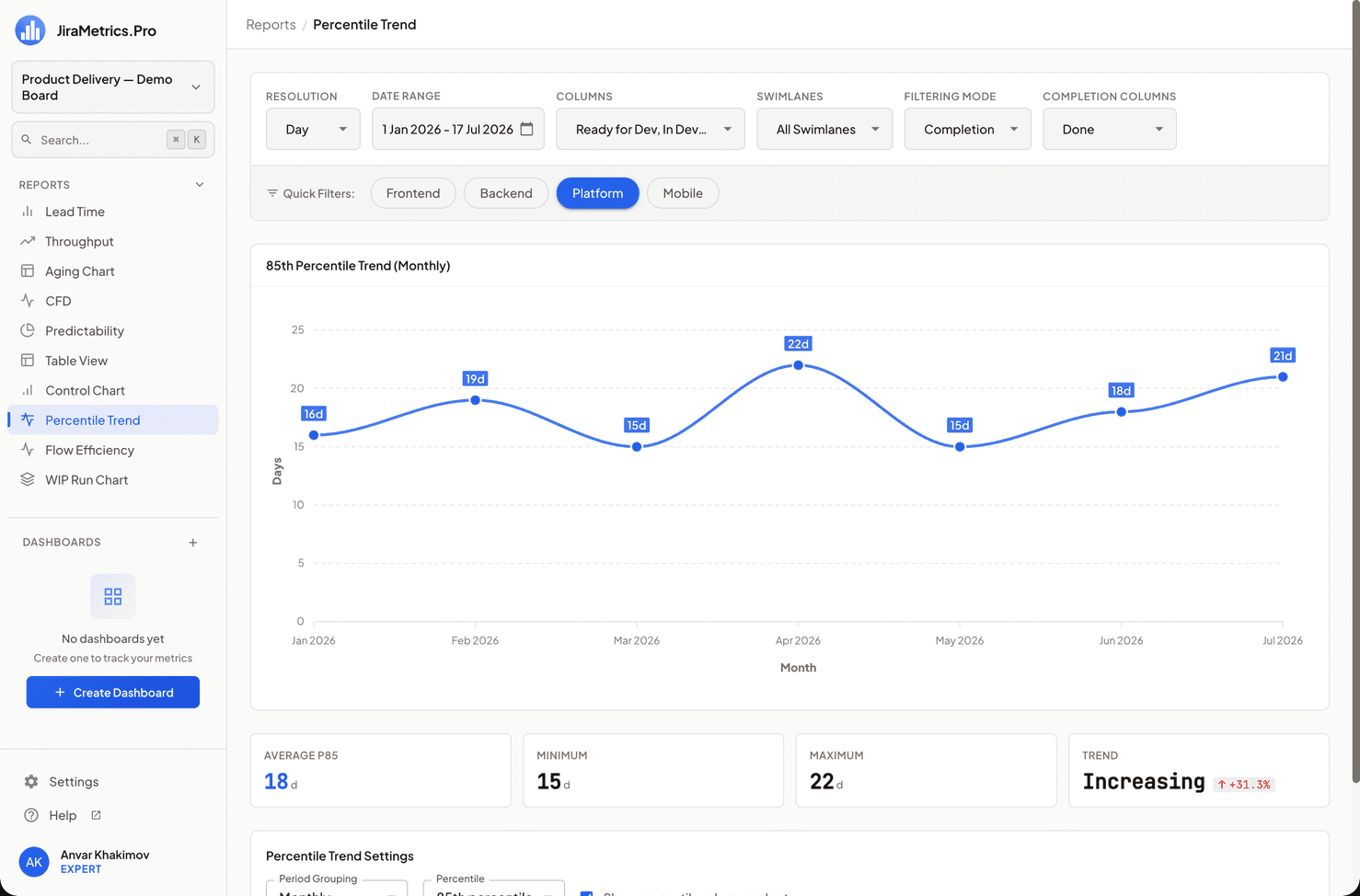
- X-axis: Periods (months, quarters, or years — depends on the Period setting).
- Y-axis: Time in days. The axis is always in days, regardless of the global Resolution setting.
- Line: The value of the selected percentile in each period. You can enable value labels directly on the points.
How It Is Calculated
For each period:
- Tasks completed in this period are taken.
- Their completion time is converted into whole days (rounded up).
- A distribution is built, from which the selected percentile is taken (the cumulative distribution method, as in the Lead Time report).
- The value is rounded to whole days.
Metrics of This Report
Below the chart there is a metrics block:
- Average P85 (or another selected percentile) — the average percentile value across all periods (days). Highlighted.
- Minimum — the smallest percentile value among the periods (days).
- Maximum — the largest percentile value among the periods (days).
- Trend — the direction of the dynamics. The value in the first period is compared with the value in the last one: a change of more than 5% in either direction →
Increasing/Decreasing, otherwiseStable. A decrease is an improvement (green ↓), an increase is a deterioration (red ↑).
This is a trend "within the selected range", not a comparison with a separate previous period. For more details, see the Metrics and Trends section.
Interactive Elements
When hovering over a point, a tooltip appears:
- Period
- Tasks — the number of tasks in the period
- Nth percentile — the value in days
- Average — the average time in the period (days)
- Click — open this period's tasks in Jira
Impact of Settings
- Period — the period type: month, quarter (default), or year.
- Percentile — which percentile to plot: 50, 70, 80, 85 (default), 90, or 95.
- Showing values on points — enable/disable the labels.
- Filtering mode. The report is built correctly in Completion mode. In Activity mode a warning is shown — switch to Completion.
- The global Resolution setting does not affect this report — the values are always in days.
Special Cases
- If there are no tasks in any period, the report is empty.
- At least two periods with a value are required to calculate the trend — if there is less data, the Trend card shows
N/A. - Periods without completed tasks are shown as a break in the line, not as zero: "0 days" would mean instant completion rather than the absence of data.
Usage Recommendations
- Use the report to track the effect of process improvements over a long horizon — compare P85 quarter over quarter.
- A rising line is a signal that the process is becoming less predictable and slow.
- Look not only at the average, but also at the spread between Minimum and Maximum — a large spread means instability from period to period.
Last updated on