Throughput Chart Report
Detailed description of the Throughput Chart report in JiraMetrics.Pro and its interpretation.
Overview
The Throughput Chart is a diagram that displays the number of completed tasks over specific time intervals. This report helps evaluate team performance and identify trends in task delivery speed.
Chart Structure
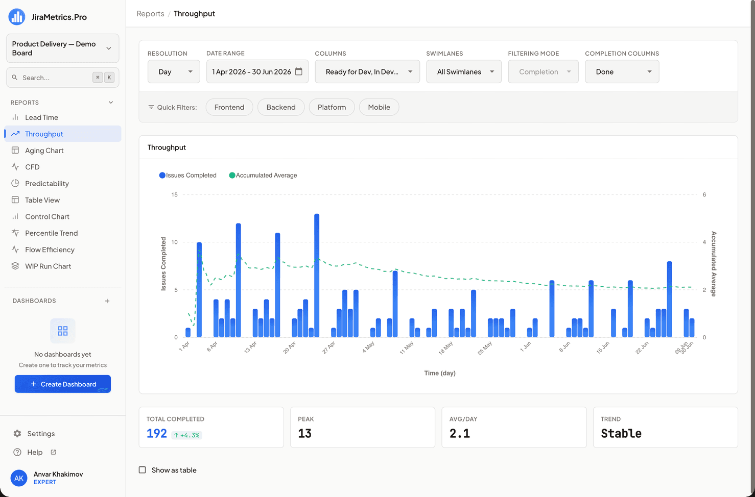
- X-axis: Time intervals (days, weeks, or months)
- Y-axis: Number of completed tasks for each interval
Throughput Calculation
It's important to understand that Throughput is calculated exclusively based on the "Completion" mode:
- Only tasks that have passed through the specified Completion Columns in the given period are counted.
- At least one column must be selected in Completion Columns, otherwise the chart will be empty.
Report Configuration
The following parameters are used to configure the report:
- Resolution: Choose the data grouping interval (day, week, month).
- Date Range: Select the analysis period.
- Completion Columns: Choose columns for analysis. This is a key parameter determining which tasks will be considered completed.
Metrics Block
Above the chart is a metrics block:
- Total Completed — the total number of completed tasks for the selected period. Highlighted. Next to it is a trend indicator — this is the only metric in the report that is compared with the previous period (an interval of the same length immediately before the current one). Growth in the number of completed tasks is shown in green, a decline in red.
- Peak — the maximum number of completed tasks in a single period (for example, in the most productive week).
- Avg / Day (or Week, Month — depending on the Resolution) — the average number of completed tasks per period.
- Trend — a text assessment of the dynamics:
Improving,Declining, orStable. It is calculated differently from the arrow on Total Completed: it is the direction of the trend line (linear regression) across all periods of the range. That is why Trend and the arrow on Total Completed may not match — this is normal: Trend answers the question about the dynamics of the whole range, while the arrow compares the last period with the previous one.
For more details on how both kinds of trend are calculated, see the Metrics and Trends section.
Interpreting Results
When analyzing the Throughput Chart, pay attention to the following aspects:
- High and stable throughput: Indicates efficient and predictable team work.
- Low or unstable throughput: May signal process problems or the need for optimization.
- Trends: May reflect changes in processes, team size, or task complexity.
- Empty chart: Usually means that no Completion Columns are selected or there were no tasks passing through the specified columns in the selected period.
Note on Filtering
Unlike other reports, the Throughput Chart always uses the "Completion" mode for task filtering. The user cannot change this mode but can configure which columns are considered completing through the Completion Columns selection.
Usage Recommendations
-
Choosing the right interval: Select an appropriate interval (day, week, month) depending on the duration of your tasks and analysis goals.
-
Trend analysis: Pay attention to long-term trends. A gradual increase in throughput may indicate process improvement or team growth.
-
Period comparison: Use the report to compare performance in different periods, for example, before and after implementing process changes.
-
Anomaly detection: Sharp spikes or drops in throughput may indicate special events or problems requiring attention.
-
Correlation with other metrics: Consider the Throughput Chart in combination with other metrics, such as Lead Time, to get a more complete picture of process efficiency.
Conclusion
The Throughput Chart is a powerful tool for evaluating team performance and analyzing trends in task delivery. Proper use of this report will help you identify areas for improvement and assess the effectiveness of implemented changes in processes.
Last updated on