Control Chart Report
A scatter plot of task completion times over time with percentile lines. The report is available on the paid plan.
Premium. The Control Chart report is available on the paid plan.
Overview
The Control Chart is a scatter plot in which each dot is one completed task. The horizontal axis shows the completion date, the vertical axis shows its completion time. The report shows how completion time is distributed over time, helps notice outliers (abnormally long tasks) and understand whether the process is stable or tasks are starting to take longer.
Chart Structure
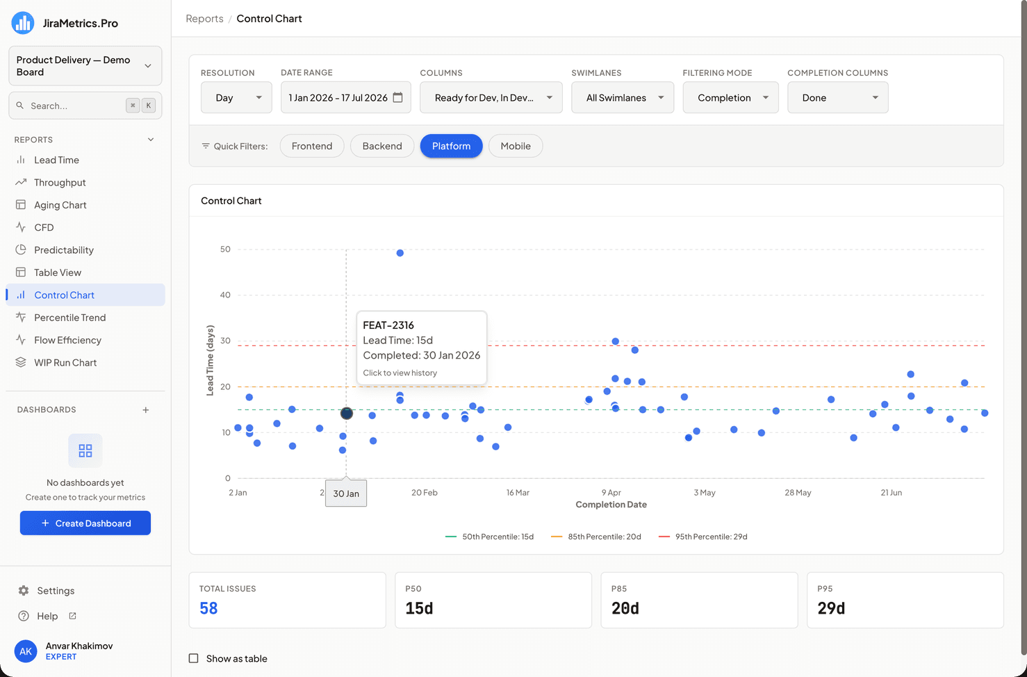
- X-axis: Task completion date.
- Y-axis: Task completion time in the selected units — days, weeks, or months (depends on the Resolution setting). Counted from 0.
- Dots: Each dot is a separate task. Hover the cursor to see the task key and the exact time; clicking opens the Task Flow dialog.
Percentile Lines
Three dashed horizontal reference lines are drawn on top of the dots:
- P50 (green) — the median: half of the tasks are completed faster than this time.
- P85 (yellow) — a reference point for SLA: 85% of tasks fit within this time.
- P95 (red) — 95% of tasks are faster; dots above this line are the "tail", candidates for analysis.
A line is shown only if its value is greater than 0. The same values are duplicated in the caption below the chart.
How It Is Calculated
- A dot's time is taken precisely — milliseconds are divided by the length of the selected unit, without rounding.
- The values of the P50/P85/P95 lines are calculated differently — the same way as in the Lead Time report: from a histogram of whole-number values, using the cumulative distribution method without interpolation. That is why a line may run slightly above the "cloud" of dots — this is expected: the dots are precise, while the lines are aligned to whole "bins".
- The lines are calculated from exactly those tasks that are visible on the chart (they have a completion date and a completion time greater than 0). The Total Issues number in the metrics block is the very base of the line calculation, so the values can be verified manually.
Metrics of This Report
Below the chart there is a metrics block:
- Total Issues — the number of tasks on the chart (the number of dots). Highlighted.
- P50 / P85 / P95 — the values of the same completion time percentiles.
The trend versus the previous period is not shown in this report. For more about metrics blocks, see the Metrics and Trends section.
Interactive Elements
When hovering over a dot, a tooltip appears:
- Task key
- Lead Time — the exact completion time
- Completed — the completion date
- The "Click to view history" hint — clicking opens the task history
Impact of Settings
- Resolution changes the unit of the Y-axis (days/weeks/months). The dots remain precise, while the percentile lines are aligned to whole units — with a large unit (weeks, months) they look more "stepped".
- Selected columns, completion columns, filtering mode, date range, swimlanes, and quick filters have the same effect as in other reports.
Tabular Representation
The "Show as table" toggle displays a list of tasks sorted by completion time in descending order. Rows lead to Jira or open the task history — convenient for analyzing the longest tasks.
Special Cases
If there is not a single task with a completion date and a completion time greater than 0, the report shows an empty state.
Usage Recommendations
- Pay attention to dots above the P95 line — these are the longest tasks, analyze them separately.
- If the dots' completion times grow from left to right, the process is slowing down and it is worth finding the cause.
- The vertical spread of the dots shows variability: the greater it is, the less predictable the process.
Last updated on