Flow Efficiency Report
What share of a task's completion time is active work and what share is waiting. The report is available on the paid plan.
Premium. The Flow Efficiency report is available on the paid plan.
Overview
Flow Efficiency shows what share of a task's completion time is active work and what share is waiting. The formula:
Flow Efficiency, % = Active Time / Total Time × 100The higher the efficiency, the less tasks "hang" in queues and waiting between stages. It often turns out that most of the time a task is simply waiting rather than being processed — this report makes such a picture visible.
For the report to work, you need to specify which columns are considered "active" (see below).
Chart Structure
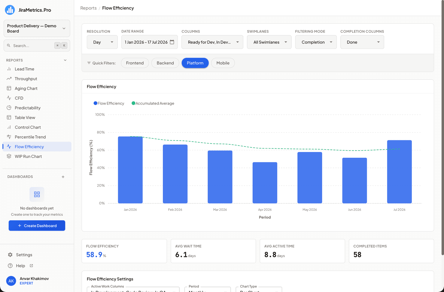
- X-axis: Periods (week, month, quarter, or year).
- Y-axis: Efficiency as a percentage (from 0 to 100).
- Bars or a line (your choice) — the efficiency for each period.
- The "Accumulated Average" line — the cumulative average of efficiency on a running total basis.
How It Is Calculated
For each task completed in a period:
- Active time — the sum of time spent in the columns marked as "active".
- Total time — the sum of time across all selected columns.
- Period efficiency = (total active time / total time) × 100.
The "Accumulated Average" line is a simple average of the period efficiencies, accumulated from left to right.
Metrics of This Report
Below the chart there is a metrics block:
- Flow Efficiency — the overall efficiency, calculated as a weighted value (total active time ÷ total time across all tasks). Highlighted. Note: this weighted number may differ slightly from the last point of the "Accumulated Average" line, because the line is a simple average while the card is weighted.
- Avg Wait Time — the average wait time per task in days: (total − active) / number of tasks.
- Avg Active Time — the average active time per task in days.
- Completed Items — the number of completed tasks.
The trend versus the previous period is not shown in this report. For more about metrics blocks, see the Metrics and Trends section.
Configuring Active Columns
Using the active columns dropdown, mark the statuses where real work happens (for example, "In Progress", "Review"), and do not mark queues and waiting (for example, "Backlog", "Waiting").
Until active columns are selected, the report shows a configuration screen instead of the chart — efficiency cannot be calculated without them.
Interactive Elements
When hovering over a bar/point, a tooltip appears:
- Period
- Efficiency — the efficiency as a percentage
- Active Time — the active time (days)
- Total Time — the total time (days)
- Tasks — the number of tasks
- Click — open the period's tasks in Jira
Impact of Settings
- Active columns — which statuses are considered work (see above).
- Period type — week, month (default), quarter, or year.
- Chart type — bars or line.
- Plus the global filters: selected columns, filtering mode, date range, swimlanes.
Usage Recommendations
- Low flow efficiency is normal for many teams; its dynamics matter more than the absolute value.
- Watch Avg Wait Time: if the wait time is growing, tasks are idling longer and longer between stages.
- Choose the active columns carefully — the result depends on this directly. If you mark waiting as active work, the efficiency will be overstated.
Last updated on