Cumulative Flow Diagram (CFD) Report
Detailed description of the Cumulative Flow Diagram report in JiraMetrics.Pro and its interpretation.
Overview
The Cumulative Flow Diagram (CFD) is a powerful visual tool for analyzing the flow of tasks through various stages of your workflow. It allows you to assess team performance, identify bottlenecks, and forecast completion times.
Chart Structure
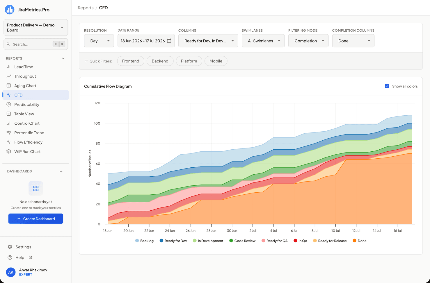
- X-axis: Timeline (dates)
- Y-axis: Number of tasks
- Colored areas: Each color represents a separate status or work stage, corresponding to the columns of your Kanban board
Interpreting the Diagram
-
Band width: Shows the average time tasks spend in a certain status. A wide band may indicate a potential bottleneck.
-
Slope of lines: A steep rise in a line indicates a rapid increase in the number of tasks in that status, while flat sections indicate stability or stagnation.
-
Gaps and overlaps: Gaps between areas may indicate loss of work, while overlaps may indicate parallel work or rework.
-
Overall trend: The overall slope of the top line shows the rate at which new tasks are entering the system.
Interactive Elements
-
Tooltips: When hovering over a specific point on the diagram, a tooltip appears containing:
- Date
- Number of tasks in each status
- Total number of tasks on that date
-
Daily details: Clicking on a specific day displays detailed information at the bottom of the page:
- List of tasks divided by status
- Task numbers are presented as clickable links leading to the corresponding task page in Jira
-
Display management: Clicking on a legend element hides or shows the corresponding column. Cmd/Ctrl + click leaves only the one selected column on the diagram (another Cmd/Ctrl + click brings them all back) — convenient for focusing on a single stage.
Report Configuration
The main filters (period, swimlanes, quick filters) are located in the common filter panel above the report, not below the diagram. For more details, see the Data Sampling and Filtering section.
The diagram itself has a "Show all colors" toggle (in the card header, enabled by default). When it is turned off, columns that are not among the selected ones are shown muted (semi-transparent) — this makes it easier to highlight the stages you need without removing the rest completely.
Usage Recommendations
-
Trend analysis: Regularly track changes in the shape and size of areas to identify long-term trends.
-
Bottleneck identification: Pay attention to expanding areas that may indicate task accumulation in a certain status.
-
Performance assessment: Analyze the speed of task transitions from one status to another to evaluate process efficiency.
-
Forecasting: Use the slope of lines to predict completion times for future tasks.
-
Detailed analysis: Use the day-click function for in-depth analysis of the project state on a specific date.
-
Focus on specific stages: Use the legend to hide or display certain columns to concentrate on specific aspects of the process.
Conclusion
The Cumulative Flow Diagram provides a comprehensive view of work flow in your project. Regular CFD analysis will help you optimize processes, improve predictability of timelines, and increase overall team efficiency. The flexibility of configuration and interactive elements allow you to adapt the analysis to the specifics of your workflow.
Last updated on