Aging Chart Report
Detailed description of the Aging Chart report in Jira Metrics Plugin and its interpretation.
Overview
The Aging Chart is one of the key flow management tools in the Kanban method, designed to visualize the time tasks spend in progress.
The aging chart shows how long work items remain in the system and is a critically important tool for identifying blocked items and managing delivery risks.
The chart helps teams:
- Identify risks of not meeting deadline commitments
- Find blocked tasks before they become critical
- Manage stakeholder expectations based on data
- Make decisions about prioritization and escalation
Key Principle: The chart shows current tasks in progress against historical statistics, allowing you to understand which tasks are progressing at a normal pace and which require attention.
How the Chart Works
The Aging Chart is built on two types of data that provide a complete picture of what's happening:
1. Current Tasks in Progress
These are all tasks currently being processed on your board. These tasks are displayed as dots on the chart. Each dot shows how many days a task has been in progress.
2. Historical Statistics for Comparison
To understand whether the current work pace is normal or problematic, the chart uses statistics from previously completed tasks. This statistics creates color zones and horizontal reference lines on the chart.
How to configure historical data: Historical statistics are automatically calculated based on:
- Selected time period (e.g., last 3 months)
- Applied filters (projects, task types, teams)
- Selected workflow columns
By changing these settings through filters, you can compare current work with different periods or conditions from the past, gaining more accurate understanding of performance.
How to Read the Chart
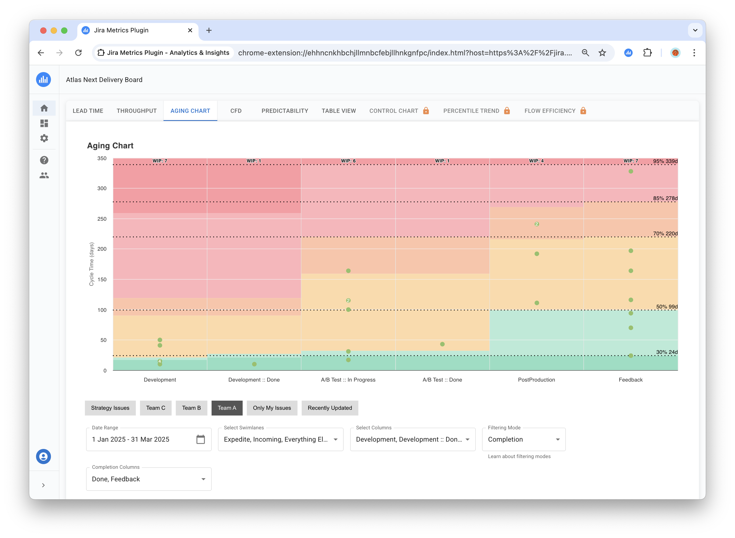
Chart Axes
- Horizontal axis (X): Your Jira workflow columns
- Vertical axis (Y): Task execution time in days
Tasks on the Chart
Each task currently in progress is shown as a green dot:
- Higher position = longer time in progress
- Number on dot = shows task count if multiple tasks have similar timing
- Click on dot = opens detailed task information
Visualizing the time items spend in the system is critically important for understanding delivery predictability and identifying process anomalies.
Interactive Elements
Tooltip Information
When hovering over a dot, a tooltip displays:
- Task key(s) (clickable links)
- Accumulated time for each task in days
- Multiple grouped tasks are listed separately
Task History Dialog
Clicking on a task key in the tooltip opens a detailed task history dialog showing the task's journey through workflow columns.
Chart Settings
Selecting Reference Lines
You can configure which historical reference points to show on the chart:
- Available options: 30%, 50%, 70%, 85%, 95%
- Multiple selection possible - choose lines important for your team
- Default: all five lines are shown
Color Zones and Reference Lines
The chart shows colored bands and horizontal lines that help understand how current tasks are performing:
What Color Zones Mean
Color zones are calculated separately for each column based on accumulated time of tasks in that column from historical data:
- Green zones (light shades) — tasks are executing faster than usual for this column ✅
- Yellow-orange zones — tasks are executing at normal pace for this column ⚠️
- Red zones — tasks are executing slower than usual for this column, require attention 🚨
Calculation specifics: Each column considers accumulated time — the total time a task has spent from process start to the current column. Therefore, color zones become "higher" in subsequent columns, reflecting the natural increase in total execution time.
Percentile Lines
Horizontal lines show historical reference points:
- 30%, 50%, 70%, 85%, 95% — statistical markers from past experience
- If a task is above the 85% line — it's executing slower than 85% of similar tasks in the past
- If a task is below the 50% line — it's executing faster than half of similar tasks
Important to understand: percentiles in the aging chart are not a plan, but a risk indicator. They help the team understand when to pay attention to a task and take action.
Important to remember: Colors and lines may differ for different columns because statistics are calculated separately for each work stage.
Available Filters
The Aging Chart includes comprehensive filtering options:
Filter Impact on the Chart
All filters in the Aging Chart perform two important functions:
- Control scope for statistics calculation — determine which historical tasks to use for building percentiles and color zones
- Filter displayed current tasks — which WIP tasks to show as dots on the chart
Main Filters:
- Time frames: Period for calculating historical statistics (e.g., last 3 months)
- Quick filters: Pre-configured board filters
- Swimlanes: Filter by specific swimlanes
- Selected Columns: Defines workflow columns that:
- Display on the chart (X-axis)
- Participate in accumulated time calculation
- Used for building statistics
- Filtering mode: Criteria for determining completed tasks
Important: Changing any filter recalculates all statistics and can significantly change color zones and percentile lines.
What the Chart Says About Your Work
1. Identifying Problems and Risks
Look at tasks in red zones — these are tasks executing slower than 95% of similar tasks from the past. Items in the upper part of the aging chart represent the highest risk to team reputation and customer satisfaction.
Pay attention to task clusters in one column — this may indicate:
- Process bottleneck
- Shortage of people or skills at this stage
- Technical problems or dependencies
Tasks above the 85th line already require attention, don't wait for them to reach the red zone.
2. Understanding Overall Process Health
Healthy process looks like:
- Tasks evenly distributed across columns
- Most dots are in green and yellow zones
- Few tasks in red zones
Problematic process:
- Many tasks accumulated in one or two columns
- Many red dots (especially in initial columns)
- General "upward shift" of all tasks on the chart
3. Early Warning of Future Problems
The aging chart works as an early warning radar. Problems you see today in initial columns will become big problems tomorrow in final columns.
What to watch for:
- Tasks in red zone in initial columns — they will definitely cause problems later
- Growing number of tasks above 85th line — trend toward deterioration
- Repeating patterns — same problems every week
4. Data-Driven Decision Making
Questions the chart answers:
- How much work can we take on simultaneously?
- Which column regularly has problems?
- Are our process improvements helping?
- Which tasks need escalation right now?
Possible approaches to problem solving:
- When there are too many tasks in red zones some teams reconsider WIP limits
- For persistent problems in specific columns consider resource reallocation or process adjustments
- When tasks regularly "age" in certain columns it's worth analyzing and possibly adapting the workflow
How to Use the Chart in Work
1. Daily Standups Usage Options
Aging Chart can be useful for structuring discussions:
- Teams often start by reviewing tasks in red zones to identify priorities
- Tasks above the 85th line may signal the need for additional support
- New tasks in yellow zones are worth noting for monitoring
Many teams find it helpful to use the aging chart as a starting point for conversations about flow blockers.
2. Percentile Configuration
Percentile selection depends on team needs:
- Simple analysis: 50% and 85% lines
- Detailed analysis: all five lines (30%, 50%, 70%, 85%, 95%)
- Historical period: adjust to team planning cycles
3. Connection with Other Reports
Use together for complete picture:
- CFD (Cumulative Flow) — shows task accumulation, Aging Chart — what to do with them
- Lead Time — shows how long completed tasks usually take
- Throughput — how many tasks we complete, Aging Chart — are we taking too much work
4. Examples of Working with Problematic Tasks
Approaches to working with tasks in red zones:
Teams use different strategies for working with problematic tasks:
- Analyzing tasks by clicking on dots to open in Jira
- Identifying blockers and dependencies that hinder progress
- Assigning responsible parties for resolving identified issues
- Setting timeframes for unblocking
Process improvement options:
- When problems recur in one column, consider analyzing processes at that stage
- When red tasks appear frequently, teams may consider adjusting WIP limits
The specific approach depends on team culture and workflow characteristics.
Practical Recommendations
Basic Usage Principles
- Focus on tasks in red zones as risk indicators
- Look for systemic causes of problems
- Use the chart for trend identification, not one-time assessments
- Regularly review percentile settings for team needs
Data Quality
The aging chart is only as good as your data. Ensure columns reflect real work stages, not formal statuses.
Check:
- Are all important work stages represented by columns?
- Do you move tasks to the next column as soon as work begins?
- Do filters match your actual work scope?
Conclusion
The Aging Chart is not just a pretty picture, but a practical tool for managing delivery risks. Practice shows that teams regularly using the aging chart significantly more often meet their commitments on time.
You can start with simple steps: introduce your team to the chart, try discussing problematic tasks at standups, strive to make data-driven decisions. Gradually teams learn to notice problems before they become critical, helping customers receive results more predictably and on time.