Lead Time Report
Detailed description of the Lead Time report in Jira Metrics Plugin and its interpretation.
Overview
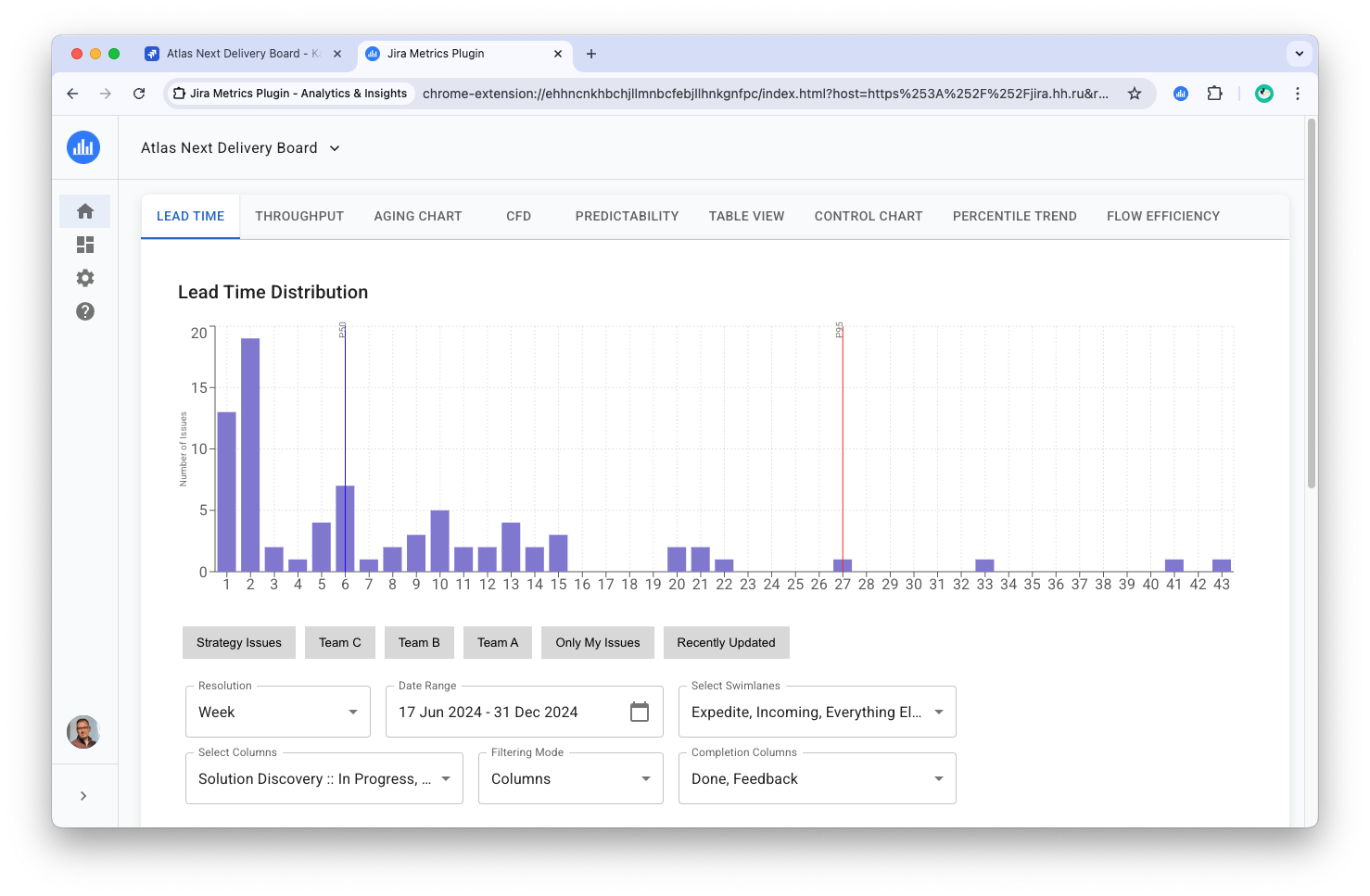
The Lead Time report is a distribution histogram that displays task completion times. This report is ideal for general assessment of workflow durations and identifying different types of tasks.
Histogram Structure

- X-axis: Task completion time (in days, weeks, or months)
- Y-axis: Number of tasks completed in the specified time
The graph also marks two key lines:
- Blue line: 50th percentile (median). Shows the time in which half of all tasks are completed.
- Red line: 95th percentile. Marks the time in which the vast majority of tasks are completed. Tasks to the right of this line are considered "tails" or anomalies and require separate analysis.
Interactive Elements
When hovering over a histogram bar, a tooltip appears with the following information:
- Lead Time: Completion time for this group of tasks
- Tasks: Number of tasks in this group
- Percentile: Percentage of tasks that are completed in this time or faster
[Image of hover tooltip]
Lead Time Calculation
Lead Time is calculated as the sum of time a task spent in all selected columns. It's important to note:
- The selection of columns in the "Select Columns" filter determines which tasks are included in the sample and what time is considered in calculations.
- You can select multiple columns, not necessarily sequential on the board.
- Time in the last column on the board (usually "Done") is not included in the total Lead Time.
- The report considers all tasks for the selected period, regardless of their status (closed or not).
Impact of Filtering Mode
The filtering mode ("Activity" or "Completion") affects the set of displayed tasks:
- Activity: Considers all tasks active in selected columns during the specified period.
- Completion: Focuses on tasks that have passed through specified completion columns.
For more details on filtering modes, see the Filtering Modes section.
Additional Statistics
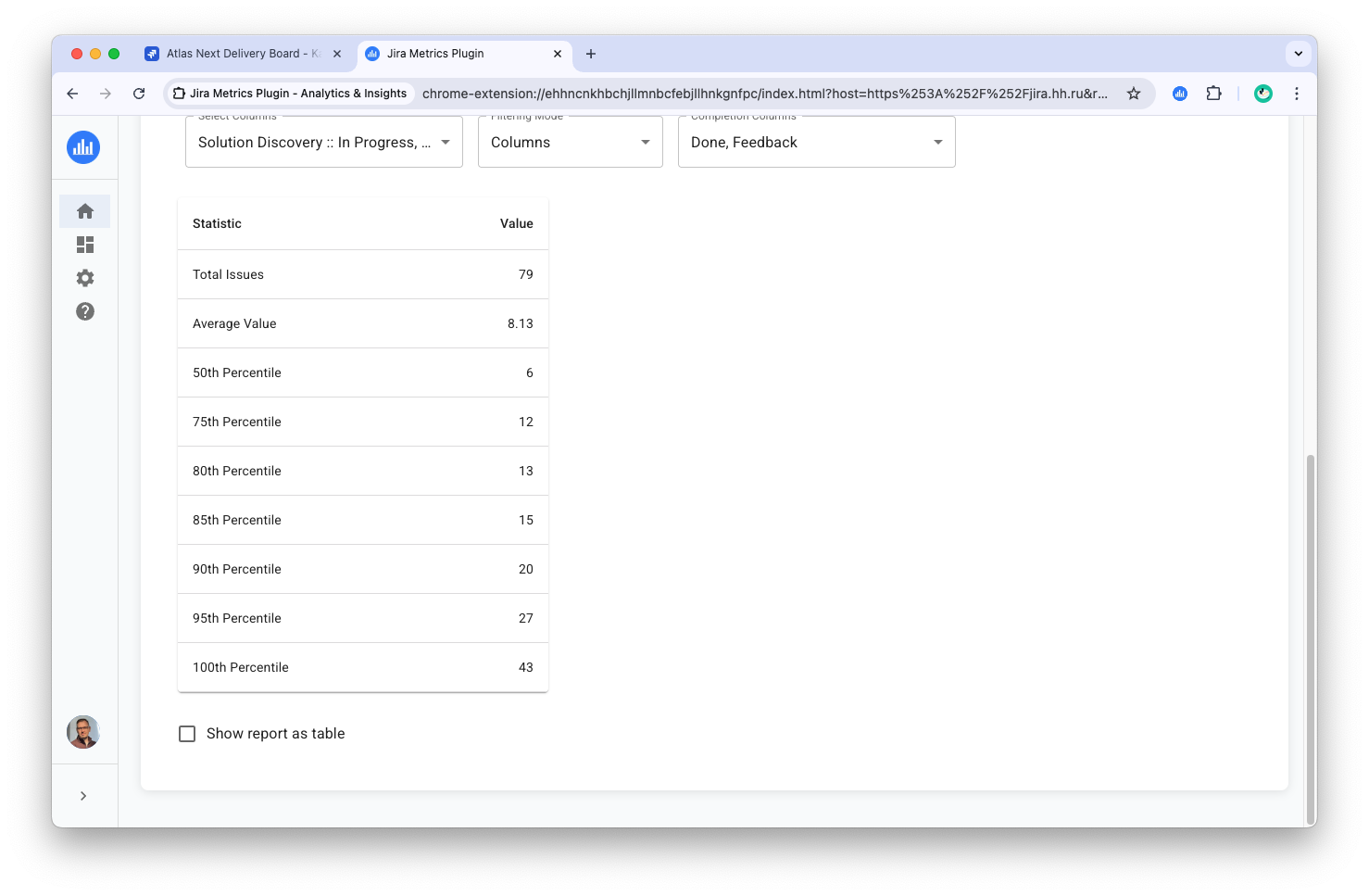
Below the histogram is a table with statistical indicators:

- Total Tasks: Total number of tasks in the sample
- Mean Time: Average task completion time
- Percentiles: Calculated values for 50th, 75th, 80th, 85th, 90th, 95th, and 100th percentiles
Statistics Calculation Formulas
Mean Time
Formula: Frequency-weighted average
Mean = Σ(completion_time_i × task_count_i) / Total_task_count
Example: If there are 2 tasks at 1 day, 3 tasks at 2 days, and 1 task at 5 days:
Mean = (1×2 + 2×3 + 5×1) / (2+3+1) = 13/6 = 2.17 days
Percentiles
Definition: Pn is the completion time value at which n% of tasks have time ≤ this value.
Calculation Method: Discrete method with cumulative distribution
- Tasks are grouped by completion time
- Cumulative sum is calculated
- Percentile = first value where (accumulated count / total count) × 100 ≥ target percentile
Example of 50th percentile (median) calculation:
- 2 tasks at 1 day (33.3% accumulated)
- 3 tasks at 2 days (83.3% accumulated)
- 1 task at 5 days (100% accumulated)
Since 83.3% ≥ 50%, P50 = 2 days
Why This Method Is Used
- Data Consistency: Lead Time values are rounded to whole units (days/weeks/months), and histogram consists of discrete "bins". Discrete nearest-rank percentile without interpolation correctly reflects this data nature.
- Interpretability: Percentiles return actual values on X-axis, matching P50/P95 lines on the graph and understandable to business.
- Outlier Resistance: Median and high percentiles are less sensitive to individual anomalies than the mean.
- Report Consistency: Method is consistent with tables/widgets; adding "empty" bins (count=0) doesn't affect results.
Excluded Tasks
Tasks with completion time of 0 days are excluded from calculations but displayed as a separate counter.
Tabular Data Representation
The "Show Reports as Table" option allows you to display all tasks in a table format, where each row corresponds to a histogram bar. The table is sorted by Lead Time from highest to lowest, which is convenient for analyzing tasks with the longest completion times.
Usage Recommendations
-
Use quick filters for more precise analysis. For example:
- To analyze only closed tasks:
Resolution != Unresolved - To analyze tasks for a specific period:
Resolved >= $Start_date AND Resolved < $End_date
- To analyze only closed tasks:
-
Pay attention to tasks falling into the "tail" of the distribution (after the 95th percentile). They may indicate process problems or require special attention.
-
Regularly analyze changes in Lead Time distribution to track the effectiveness of implemented improvements.
-
Use the tabular representation when preparing for delivery process reviews, focusing on tasks with the longest completion times.